The post of Peak of chic about history inspired me this morning and made me want to share with you the modernity of the XVIII th century .
For us, XVIII th century mean faded colors , colors with powder, Marie Antoinette pastel colors such as her famous grey.
BUT we have to think that most of the colors have crossed the years and the centuries , so they are now faded and also all these prints and paintings were made with natural colors so they were brighten .
It was Designers Guild colors in the XVIII th centuries and before. The mix of the XVIII th century colors were garish.
So they were "modern" before modernity and it seems we haven't invented anything ...about colors
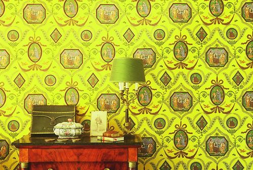
begining of the XIX th century reproduction by Braquenié
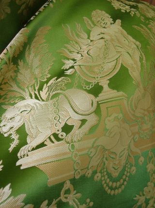
tassinari & chatel silk sample in our show room
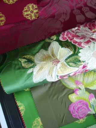
Designers guild english document
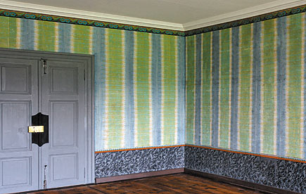
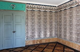
For me these wallpapers look very modern
photos source : chateau de mézières museum
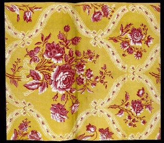
photo source : musée des arts decoratifs from la Victorienne's blog
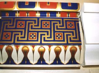
From the first hour of humanity , artist , "decorators" used bright colors look at this reconstitution of an antic greek wall . For more info about bright colors in antique Greece , check this post
For more information about fabrics and history check out these sites :
Pierre Frey archives department editorial
the collection of fabrics museum in Lyons
Next post : may be about faded colors ...
to turn white classic sheet : into a new fashion color fabric : use dye